


Opinion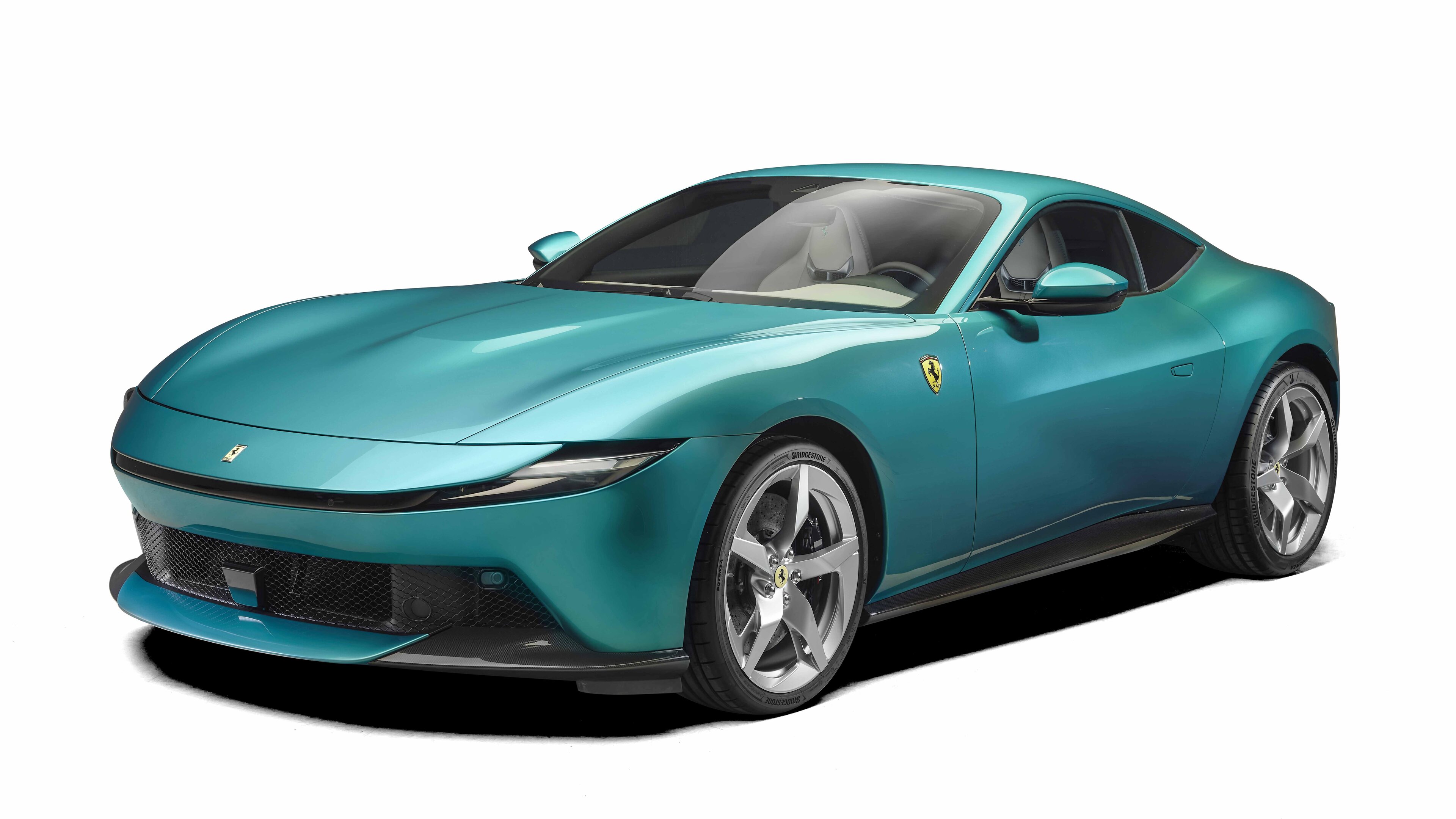
Top Gear
Frank Stephenson on the Ferrari Amalfi: "the emotional spark feels missing here"
Frank shares his... frank views on Ferrari's Roma replacement with TG...
Frank Stephenson is a car designer with more hits than the Beatles, including the Escort RS Cossie, first BMW Mini, Maser MC12, numerous Ferraris and the McLaren P1. These days he runs his own consultancy – Frank Stephenson Design. Here he shares his views on Ferrari's Roma replacement - the new Amalfi - with Top Gear.
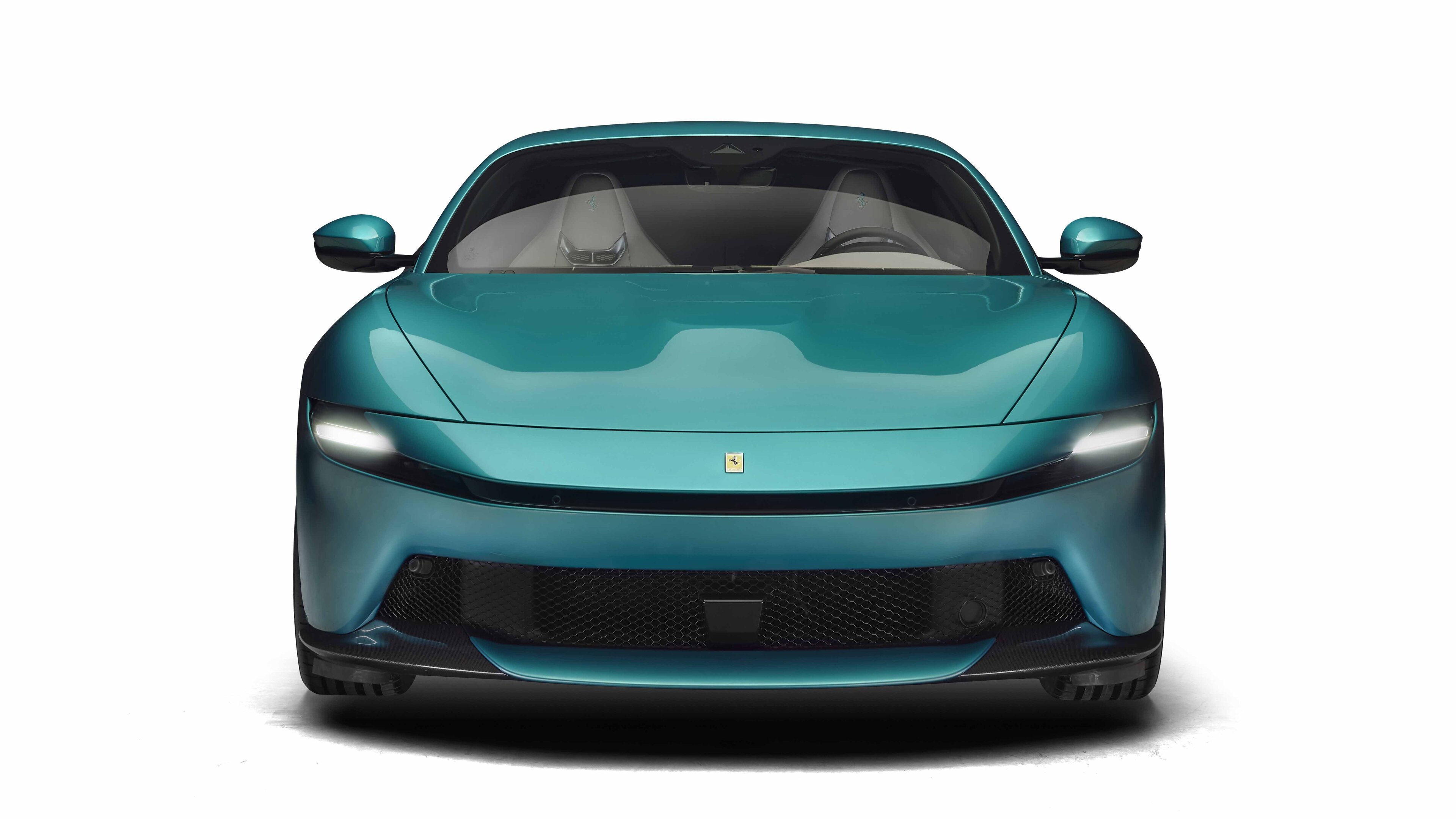
The new Ferrari Amalfi - or perhaps the second generation of the Ferrari Roma – is, overall, a well proportioned luxury GT car. At first glance, I see the intent towards a simplification of details and minimal design evolution, but I don’t immediately see Ferrari. For me, Ferrari is all about ‘fare la bella figura’, meaning it should accomplish this through casual elegance and breathtaking, striking details. The emotional spark feels missing here.
Advertisement - Page continues below
That said, the Amalfi has great proportions, looking well-balanced and hunkered down with a phenomenal stance on the road. While there are certain front end elements that leave me at a loss for words (that tongue, those reptilian eyes, not to mention the pencil line moustache), the surface sculpting of the bonnet and front fenders is exceptionally well executed, but hindered by ill-placed line cuts.
The rear is a step backward. A large, flat surfaced wall separates overly simplified, almost generic tail-lights from the back bumper and tortured diffuser area. Where have Ferrari’s recognisable round tail-lights gone? Equally as painful, the mess of split lines just above feels overly busy and incongruent.


Ferrari should’ve been more daring, pushing things an evolutionary generation into the future. There’s certainly an opportunity here for a new and improved design.
Snake-like eyes look overly sinister for a GT car. Never polite to stick your tongue out! Knife-edge straight bodyline breaks up the side volume but could use more curved acceleration to harmonise with the Amalfi's organic shape. Muscular hip contributes to the powerful and planted stance. The five-spoke blade-like wheel design is a technological masterpiece.
Advertisement - Page continues below
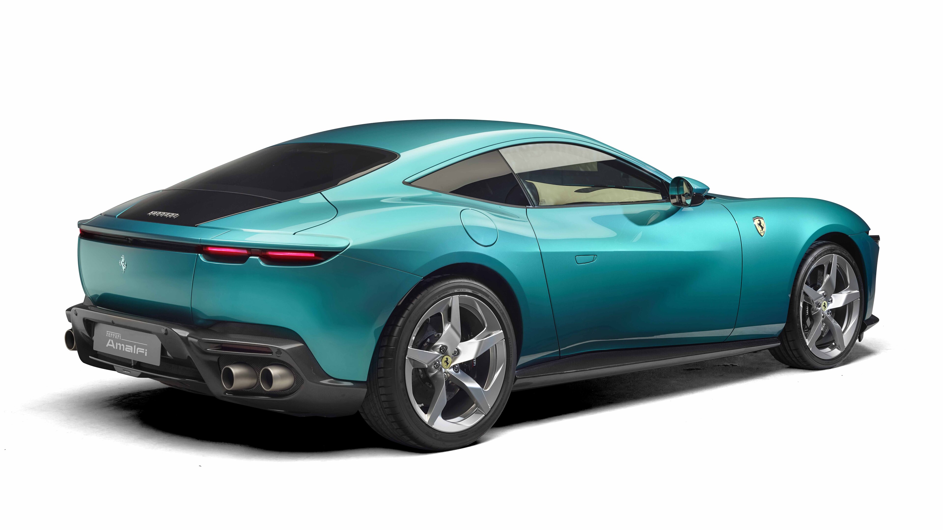
The area above the rear lights feels too busy, with multiple split lines that don't relate to each other. The tail-light design regrettably prioritises simplicity over character. Flat rear surface is devoid of character, too simple. Wraparound line connecting the rear and side, enhancing the visual flow. And a dynamic beltline.
Sensually sculpted bonnet but a pity the split lines cut through the fender bulges - a clamshell design would have been ideal. Power dome combines function with surfacing excitement.
Verdict: NOT
Top Gear
Newsletter
Get all the latest news, reviews and exclusives, direct to your inbox.

Trending this week
- Long Term Review
Mille Miglia 2026: in search of Alfa’s soul