


OpinionTop Gear
'A well executed mistake of automotive design': McLaren P1 designer on the Ferrari Luce
We ask Frank Stephenson for his... frank opinion on Ferrari's lightly controversial EV
Frank Stephenson is a car designer with more hits than the Beatles, including the Escort RS Cossie, first BMW Mini, Maser MC12, numerous Ferraris and the McLaren P1. These days he runs his own consultancy – Frank Stephenson Design. Here he shares his views on the Ferrari Luce
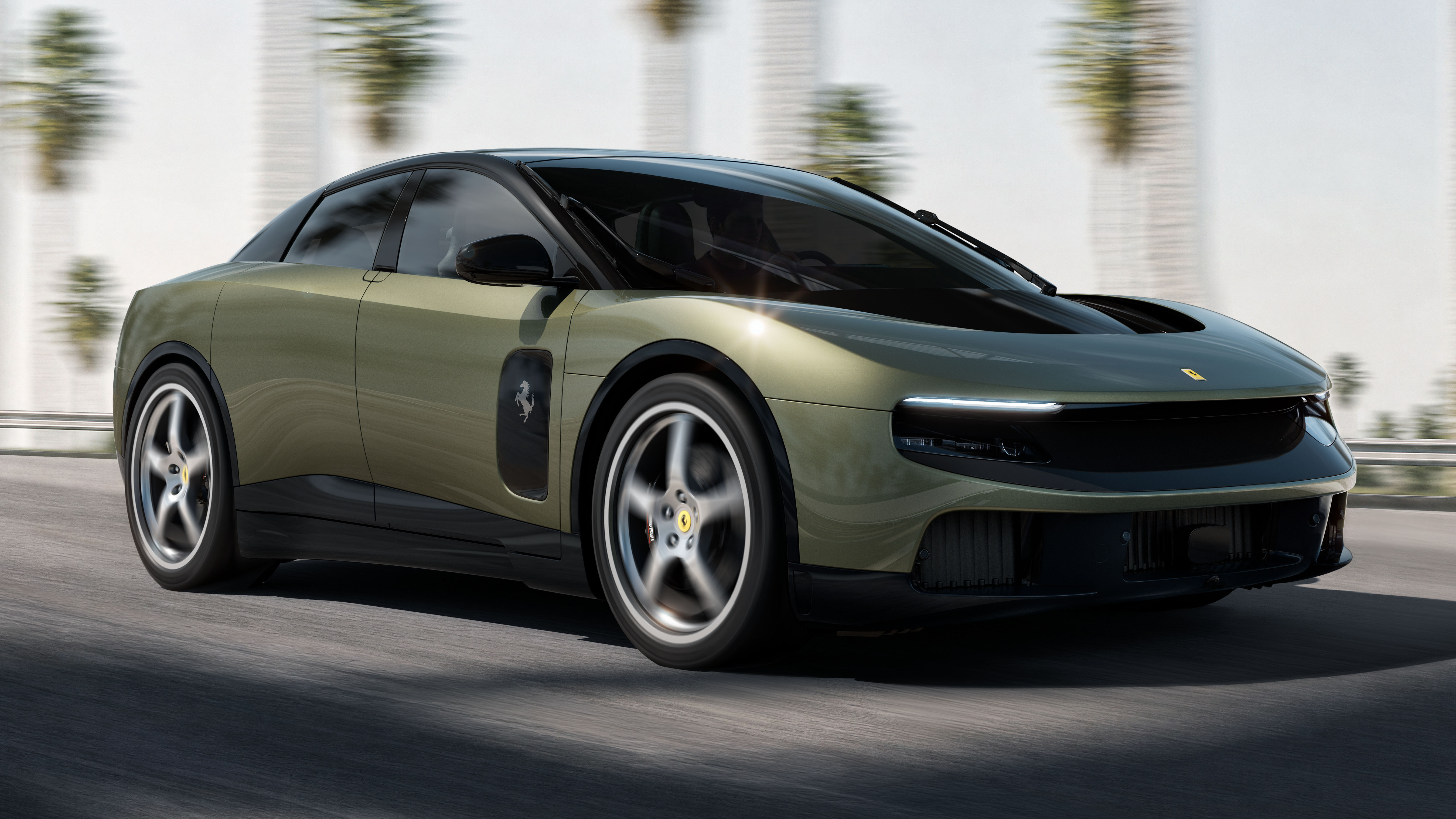
The new Ferrari Luce. What can be added that hasn't vilified it already and embarrassed its designers? Well, with the benefit of a bit of hindsight since its introduction, I’ve had time to think, instead of just delivering my first knee-jerk reaction.
Advertisement - Page continues below
So what do I now see and feel when I look at it? Honestly, a well executed, generic looking mistake of automotive design. A car that will likely go down in history as one of the biggest swing and misses in car design history. Its design is as emotionless as a used bar of soap... with four wheels attached.
For those who opine that it would be tolerable if it was badged as anything other than a Ferrari, I’m sorry, but no. Bad automotive design is bad automotive design.

Its one standout design feature is the continuous surface from the top of the front bumper, flowing uninterruptedly rearwards under the bonnet’s aero wing and up over the windscreen. At least here the designers considered the packaging advantage of the lack of a petrol engine.
The front view of the car has no distinguishing facial features – just wide expanses of bland nothingness that remind you of nothing.
Advertisement - Page continues below
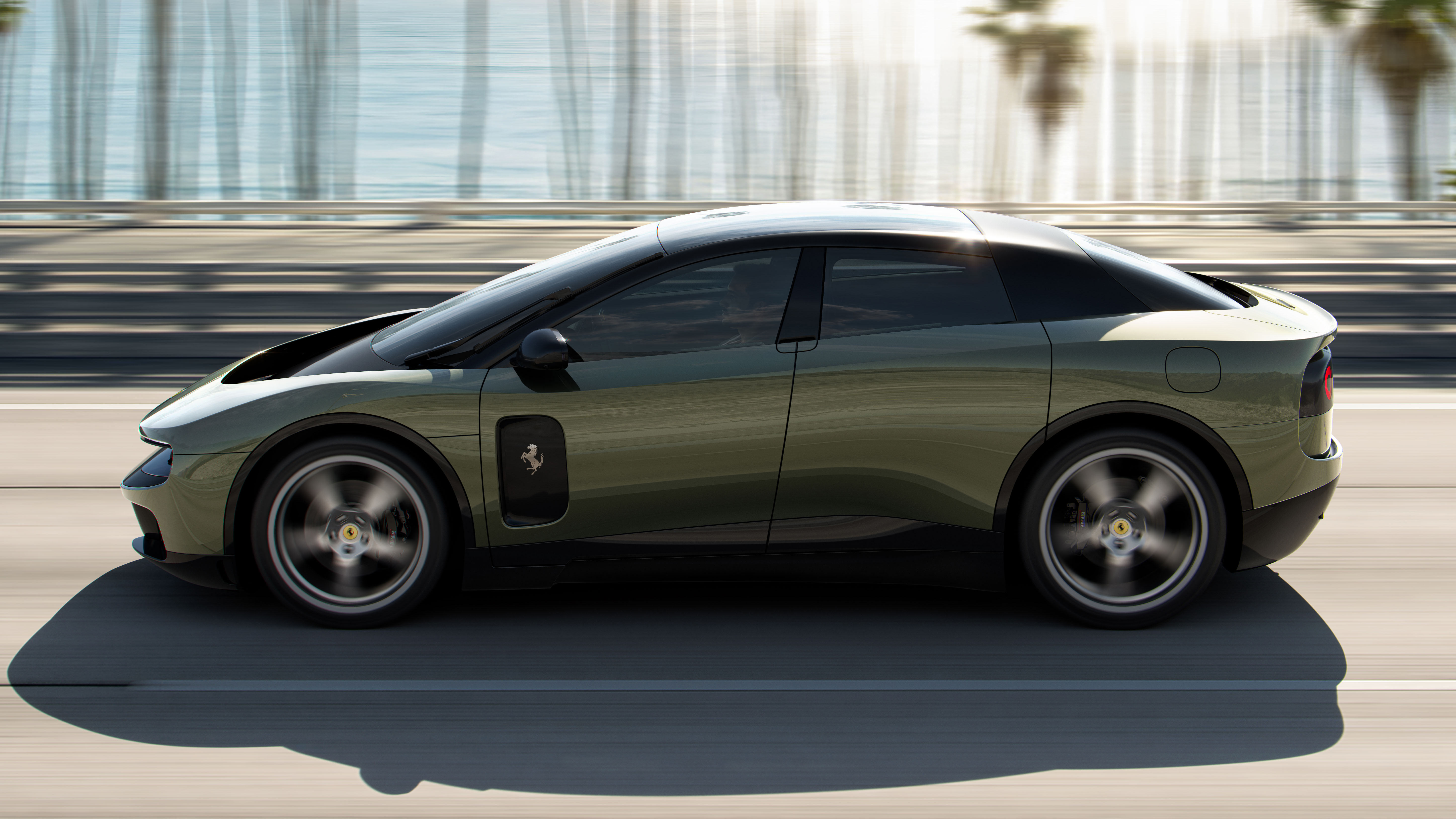
As I force my eyes to take in the Luce’s side profile, the first thing that startles me is the not so subtle tease of what is probably the new iPhone 18’s shape – that squarish and dark appliqué statically positioned on the front door, the perfect visual definition of the sound of ‘splat’.
Moving to the rear, the Luce’s design language immediately falls apart
Then there’s that boring and meandering single radius shoulder line – totally tensionless. The black graphics regrettably encircling the wheel housing edges appear to lift the body of the Luce even further away from the tyres, as if it was a wannabe off-roader.
Moving to the rear, the Luce’s design language immediately falls apart, miserably and with a grand final groan. Nothing makes sense in this view. It’s a rear end inside of a rear end, if THAT makes any sense. Never done before, hopefully never to be seen again. The four round tail-lights are a weak attempt at adding a hint of ‘Ferrariness’ that look like it took seconds to come up with.
Top Gear
Newsletter
Get all the latest news, reviews and exclusives, direct to your inbox.
Let’s address the interior design with its four doors and five seats – practical, but who used the word practical when designing a Ferrari? Layout and features, excellent, arguably the only reason to convince yourself to consider this car. The details and their execution reflect a fabulous level of quality, the whole interior comes across as being designed by a product designer suffering from OCD, and it’s very suited to a comfy family car.
But remove the badges or logos, would I realise that it’s a Ferrari? No. Would I care? Yes. As a Ferrarista, I want my Ferrari to look and feel like a true Ferrari, cutting edge and yet analogue at its best. There’s room in this world and in the future to offer authentic ‘Ferrariness’ to petrolheads and authentic ‘Appleness’ to the EV nerds – it’s the mixture of the two that dilutes each.
Just as the look of a simple brick will stand the test of time, perhaps the Luce’s design will too. But will it win Best of Show at the 2050 Pebble Beach Concours d’Elegance? I doubt it.
Trending this week
- Car Review
Land Rover Range Rover Electric